White Oak Kitchens

Photo courtesy of Cambridge Home Company

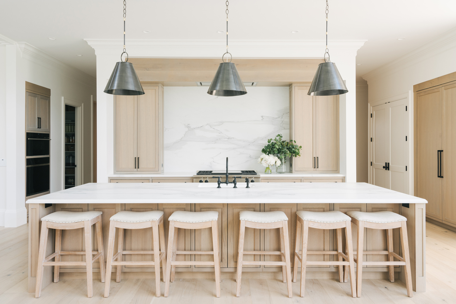
White oak is an incredibly versatile wood for cabinetry and design elements. Naturally less orange in tone than it’s red oak counterpart, the naked white oak look is everything right now. Best of all, it’s overall muted and subtle appearance will carry it through an “on trend” look and into classic feel well into the future.

The trick is going for a matte sheen, there are top coats that your cabinetry manufacturers should be able to recommend that will hush the yellow and orange brassy tones, alternately if you opt for a 5% white stain, or faint grey undertones, that can certainly help too.

Photo: Danielle Jackson / Courtesy of Magnolia

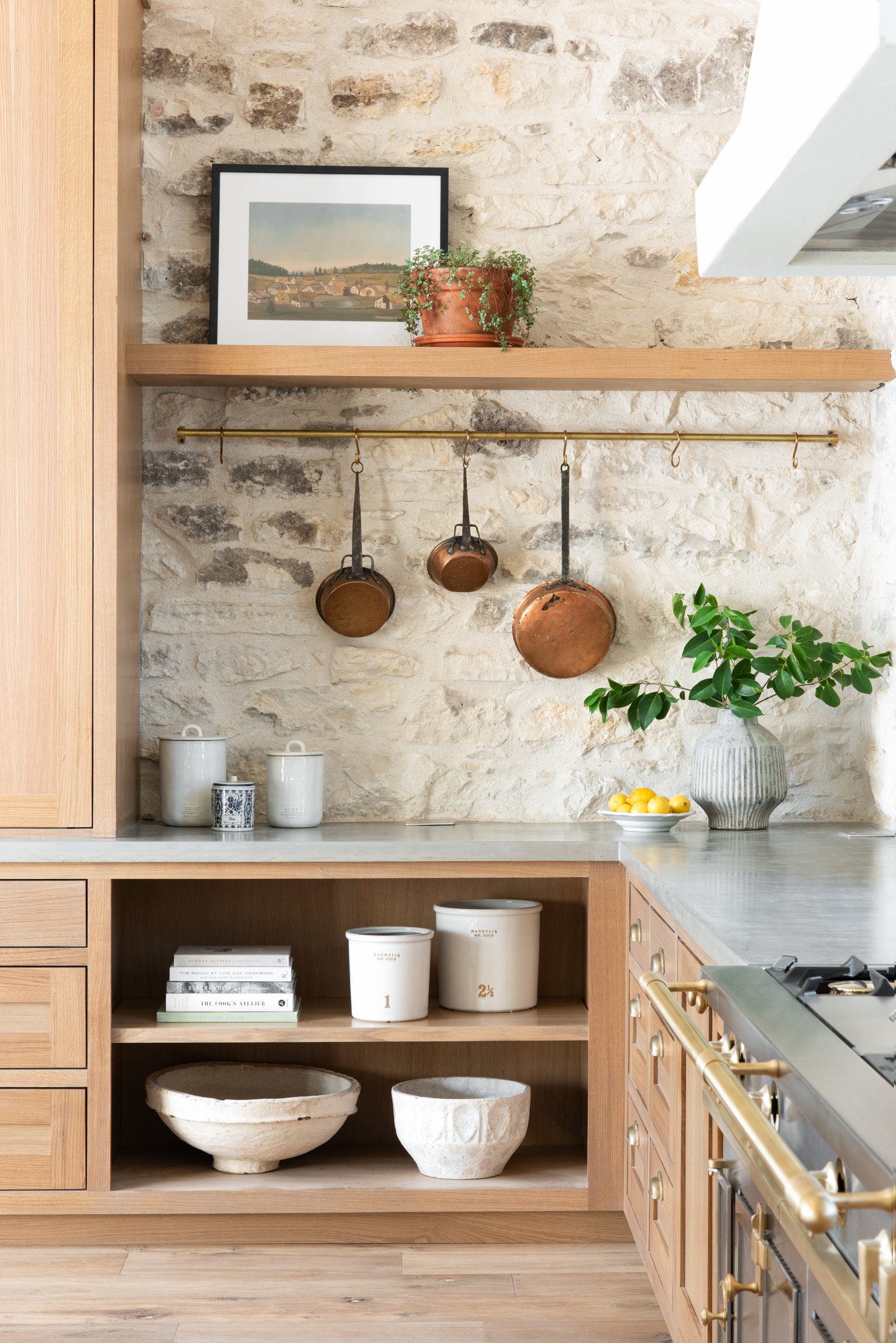
Joanna Gaines has a cooking show that will be coming up on the Magnolia network, and they have released images of the gorgeous set. The queen of restoration has done it again; this space feels like a warm hug. Time worn but stronger for it, every element from the concrete countertop to metals are muted in tone and sheen.

Photo: Mooielight

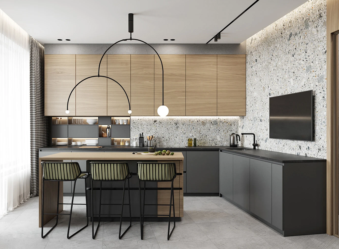
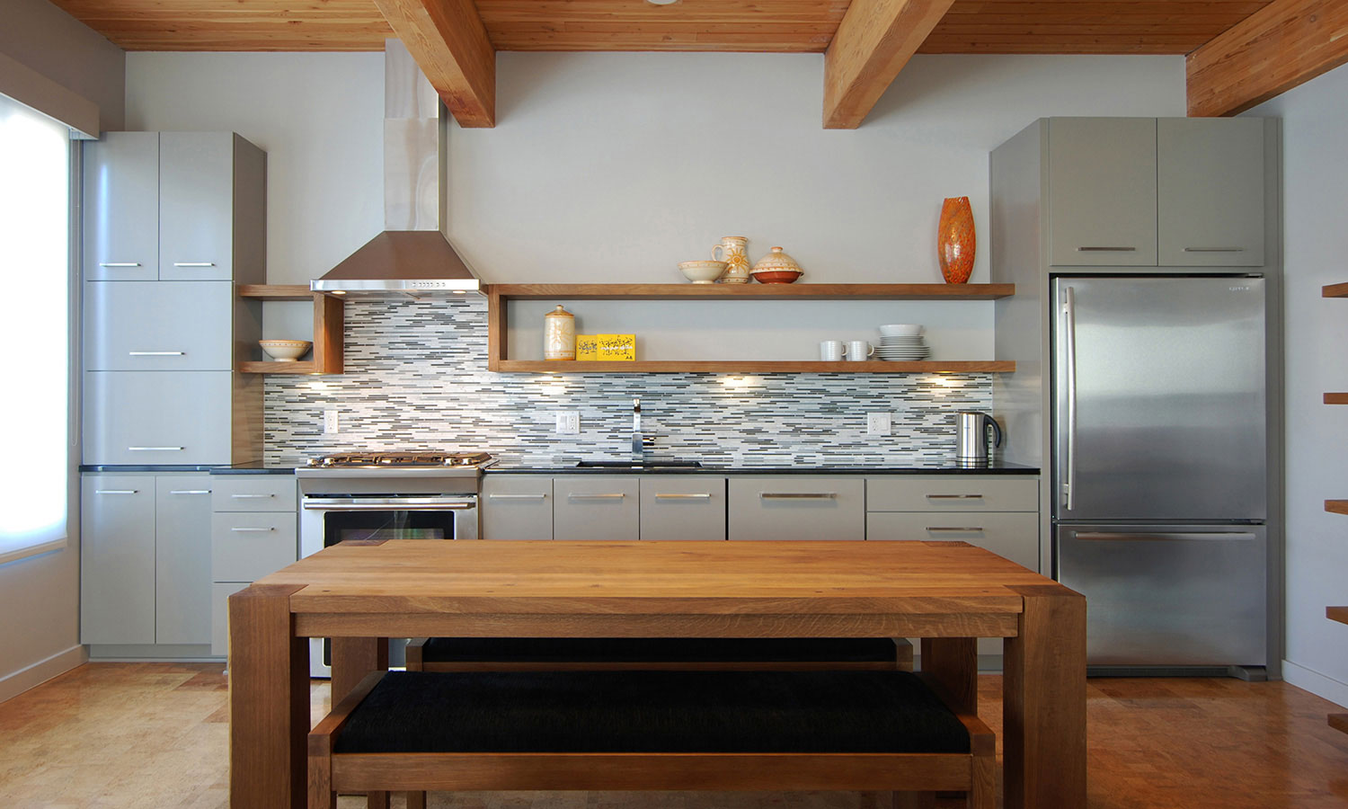
White oak is just as home in a more contemporary feel as well. These grain-matched slab doors pictured above add warmth and visual interest. Keep in mind material sheet size limitations when considering a grain matched look.

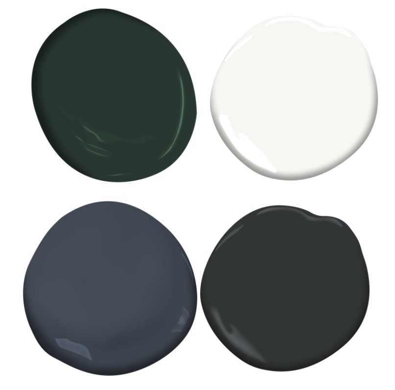
White oak does very well when paired with other painted colours. See my picks above: Top Left: Essex Green PM-11 Benjamin Moore, Top right: Chantilly Lace OC-65 Benjamin Moore, Bottom left: Hale Navy HC-154, Bottom right: Black Satin 2131-10.

I like neutral and warmer metals with white oak, so matte black or modern brushed gold are both excellent choices for hardware.

Share Button

The Mastery of an Eichler

Image source: @midcenturyhome.com

While researching interior courtyard designs in 2009 I very happily stumbled across the name; Eichler. If you live in sunny California you will already be well acquainted with the mid-century modern homes built by the forward-thinking and brilliant developer, Joseph L. Eichler.

He built built over 11,000 homes between 1950 and 1974. Eichler’s are easily distinguished by; their immense panels of glass, the post and beam construction, mahogany interior panels, vertical exterior wood panelling and the ability connect a homes exterior to the interior with incredible views through access and vantage points. Although very popular, the atrium (pictured centrally below) is not a feature in all of his homes.

Image source: @eichlersocal.com

The boxy exterior of the home’s design is punctuated by beam overhangs, and garage/carports to break up the clean lines on the front exterior elevation. The clerestory windows in the perspective above offer a tiny glimpse to the light and openness that awaits upon entry. An Eichler home is all about the interchanging play of indoor/outdoor living space, and would have had a dynamic impact on family day-to-day living, not to mention the entertainment capabilities a home like this would have!

Image source: onekindesign.com

In this remodelled Eichler (above) you can see the central atrium from a secondary room. Typically the atrium would be surrounded on 3 sides by glass-panelled walls with sliding doors, and a solid wall for the 4th. The atrium is open to the sky above and the concrete floor is broken up on the perimeter with sections for rockery and plants, like cacti.

Image Source: eichlermidcentury.com

Eichler homes were truly an American Dream; they were affordable, stylish in design and available without discrimination. Communities of Eichler homes still exist and many (thankfully) have been preserved or renovated painstakingly back to their original glory.

If anyone can dream up how to build an interior open atrium in the northern snowy region I live, please let me know.

Share Button

The No Corner Kitchen

With a little bit of planning, you can enjoy a kitchen with NO CORNER CABINETS. Corner cabinets can be awkward and an often mismanaged bit of real estate when talking about precious cabinet storage space. In the example above by Whitten Architects, yes there is a corner, but it is inside a walk in pantry. I LOVE this layout! A pocket door hides your shelving, and the fridge has been built into the wall portion. See, neat and tidy!

OR, you could have your main cabinet run fit between two side walls, this is also a clean and efficient use of space and works well with an island in front for prep and as a gathering place as in this above example by Jason Ball Interiors.

Now if you must utilize a corner here are some suggestions:

A corner sink. This also requires planning ahead as you will want to have windows at the corner preferably. Examples above by Paragon (left), and HGTV (right). Read more

Share Button

Tile Backed Cabinets

A simple and effective way to add dimension to an (almost) all-white kitchen is to add texture. I love the use of subway tile to the backs of glass-door cabinets! Shown in the image above featured in Style at Home, the subway tile backsplash is carried into the tall display cabinets. It works incredibly well because they did not select a busy tile, or differing color, it blends in but adds a subtle depth that does not compete with anything that could be placed inside the cabinet itself.

In this scenario by 82mm, the countertop material is the same marble slab used for the backsplash, so the simple white subway tile offers a different material without competing for attention.

Share Button

Tray Vignettes

Styling your table tops by artfully displaying items of use or beauty is a wonderful way to avoid chaos. A tray provides parameters and a designated spot for items, for example; oils, and frequently used spices in a kitchen. Above are examples by Stylizimo (left), and the very instagram-worthy Kristin of Damernasvarld (right).

A clean desk is the best fresh start to the day, agreed? A tray is a great landing spot for items like a glass full of pencils, a pretty letter opener, or a pill-box full of stamps. The top right image is a simple acrylic tray with a pretty card stock cut to fit inside, see the tutorial here at Just A Girl. A deep sea-green tray houses desk curiosities (left) from The Everygirl.

Notice how a small vase of flowers instantly make this bedroom tray vignette incredibly dreamy? This image above from Moth Design has repurposed a Jonathan Adler match strike as a Q-tip holder.

So assemble the troops and get organized and stylized. Above is a collection of trays I have selected for every use (from top left to bottom right):

  1. Lucite and brass tray from the Jacques Collection by Jonathan Adler.
  2. Square marble tray from Williams Sonoma. *If placing an oil or wine bottle on true marble, try using a coaster to protect the porous material.
  3. Safari leather tray by Sarreid.
  4. Acacia rectangular wood tray by Lulu and Georgia.
  5. Greek key mirrored round tray by Williams Sonoma.
  6. Black melamine large serve tray by Target.
  7. Silver plate Malmaison tray by Christofle from Bloomingdales.
  8. Orange lacquered round wood tray by Lulu and Georgia.
Share Button

Vanity Sconces On Side Walls

These three lovely examples of half-bathroom vanity walls all have on thing in common; the wall sconces have been installed on the side walls. They are all still at about eye level, but 12″ from the corner, it cleans up the narrow wall on which the mirror is mounted and brings delicious light closer to your visage. The first example is by Archer & Buchanan Architecture Ldt., the second is by 41 West.

I would love to see an example of this in which a frameless mirror takes the entire remaining wall space (full width and full height above the vanity), this would allow the sconces themselves to be reflected, adding more light. A metallic grasscloth wallpaper would also highlight the side walls beautifully by carrying the light from the sconces along the reflective finish.

Share Button

Antelope Carpet by Stark

If you enjoy animal print and find cheetah overdone, this this THIS is what you could chose. The antelope print pattern is speckled with varied sizes of white spots; like a surprise dusting of large snow flakes on caramel-coloured earth. I just loved it in Nicole Hanley Mellon’s home as covered by Vogue (see image above). Read more

Share Button

Harmonious Alignment

What do get when your architect, electrician and cabinet designer have an amazing working relationship? -Harmonious alignment. Let’s take a look of a few examples:

The image above is a foyer by Beth Webb Interiors. The window is the obvious focal point, centered in this space, it creates a perfect pivot point. The window mullions divide the wall into four quadrants, the panel moulding emanates from it. The horizontal line is further emphasized by the sconces on either side as they are mounted at the same height as the divide. There are two bench drawers, reflecting the panels above. Just looking at this foyer gives you a zen vibe, which makes it the perfect resting spot. Read more

Share Button

Fête Themed Girl’s Bedroom

Your little girl never has to leave the tea party early with a room this pretty and fun! The best part is the balloon ceiling lights by Boris Klimek. The strings also serve as the light switch!

Get this look: (top left to bottom right) Read more

Share Button

Precious Stones in Design

If you haven’t the budget for true precious mineral slabs in your next design, perhaps this might be just the ticket; Alex Turco‘s visions are alive in beautiful decorative art panels that have limitless possibilities as they are malleable and can be placed in any installation.

The “Blue Agate” panel from his Minerals Collection is on a plexiglass surface, making it a great choice for this application as a shower wall. I love how the mineral form almost mimics an ocean wave. Read more

Share Button